The Project
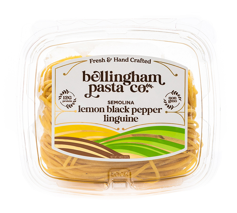
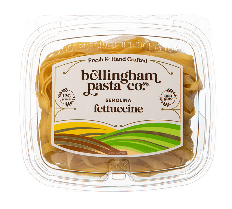
Bellingham Pasta Company approached us after expanding their product line into more stores in Bellingham, Seattle, and everywhere in between. They were hoping for a better response from their packaging within a competitive shelf location compared to their existing packaging graphics while maintaining the same clamshell package design.


The Process
We provided a variety of design concepts for Bellingham Pasta Co. and moved from a single label layout to a two sided layout so we could take advantage of the front label real estate to help get attention from passing shoppers. We also redesigned the general brand assets to be more competitive and added a gold foil accent to the labels to establish its position as a premium product and capture more attention in the light. We placed all of the nutrition information and ingredients on the back panel to help free up the primary display panel space and we created a custom label shape to fit the contours of the clamshell on both the front and back.
The Partnership
We worked with the team at BPC to help find a suitable shift in the brand elements while maintaining the personality of the Bellingham Pasta Company brand narrative. We also worked with Richmark Label in Seattle to help identify the best custom dieline and substrate for refrigerated environments. This collaborative effort made the process simple and efficient.


The Deliverables
We created 20 complete label designs, front and back, a complete brand guide for the update elements, and rebuilt the Bellingham Pasta Company web site to match the look of the retail shelf set.
We loved working with this amazing team; helping evolve the Bellingham Pasta brand elements and providing a solid foundation for continued retail success!


