Branding, Print Design
Diane Padys Photography
CLIENT
Sustainable Connections
SERVICES
Rebrand
Print Design
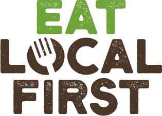
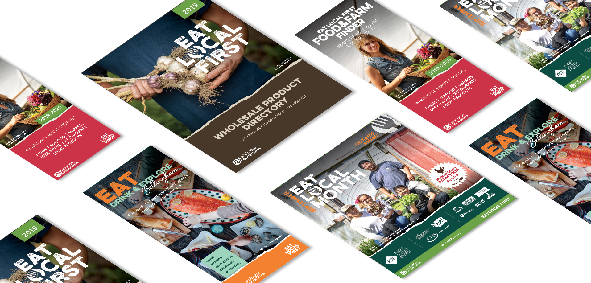
Sustainable Connections contacted us to help with their Eat Local First Rebranding project and we were so excited to jump in and knock out something amazing. The biggest challenge with this logo revision and branding guideline development was making sure that it was equally beneficial to members of the ELF program AND consumers. It had to have broad brand appeal to a huge variety of demographics all while allowing individual brands to flourish with their own look and feel.
Our process included a large collection of concepts that we’d soon determine were far too complicated to be successful for the main goal outlined above. It was a 2am “Eureka” moment after multiple revisions that we determined we needed to simplify the entire look. In the end, we landed on the logo you see on this page.
- The text logo style is simple with a modern, yet rustic, font to help maintain an approachable personality of the organization.
- We purposely eliminated any layering or shadowing to allow for consistent visibility when used by third party vendors and printers.
- We took advantage of the “O” space in Local to promote a non-verbal, detachable, icon. This can be used in a variety of ways.
- The layout lends itself to adaptability for other “..Local First” programs. Drink Local First, Think Local First, … Dance Local First.
We’re excited to amplify this logo and branding revision throughout the ELF region and we encourage everyone to look into the ELF program.
